Oh no! Your students were measuring the same object, but reported a range of values, some rather far off! Or the data points didn’t fall perfectly along a straight line! Is the activity ruined? Quite the contrary. You’ve just been given a fantastic opportunity to teach some critical concepts about data collection and analysis. Those imperfections can actually reveal a lot about the system being studied, the measurement tools involved, and the experimenters themselves!
One aspect of scientific exploration often misunderstood by non-scientists is that analyzing the date obtained in an experiment takes much longer than doing the experiment. The significance of that data usually cannot be understood without employing the branch of mathematics called statistics. Some aspects can be understood by elementary school children and can often be applied to the data gathered in Kidizen Science modules.
The most effective time to discuss statistics with respect to the kids’ results is immediately following the experiment. Here is a short activity and four five-minute discussions that can be appreciated by even the youngest experimenters (and incorporated into modules).
What are Accuracy and Precision?
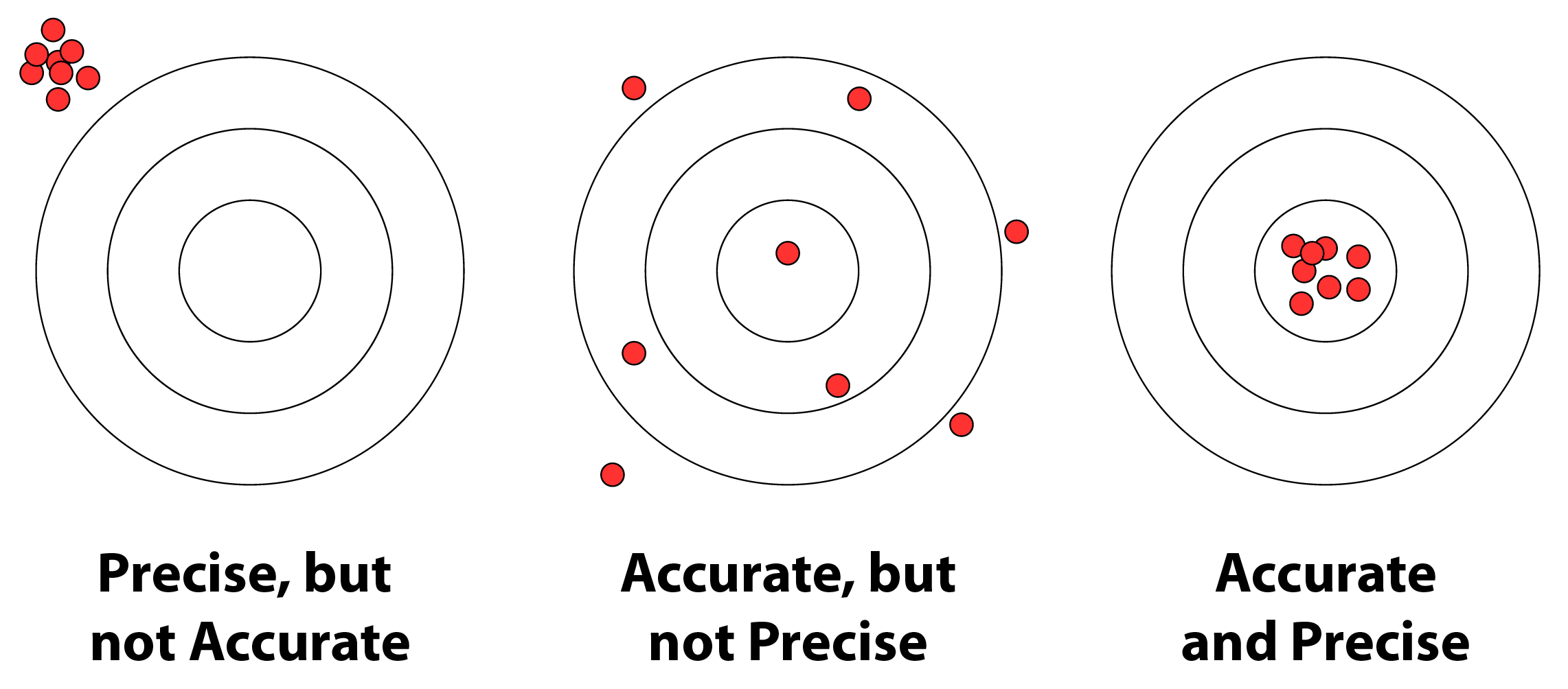
It’s likely that few of your students have actual experience with archery or marksmanship. For a quick and easy demonstration, draw a target on a large sheet of paper. Place it on the floor, and draw or mark a line a few feet away. Give each student an item that won’t roll (small bean bag, coin, button, washer, or pebble), and instruct them to stand behind the line and toss the item onto the target, aiming for the bullseye. The line should be far enough away that students can’t drop the item onto the target, but close enough that the students’ tosses will reach it. Ask your students to decide which situation the pattern of their tossed items represents.
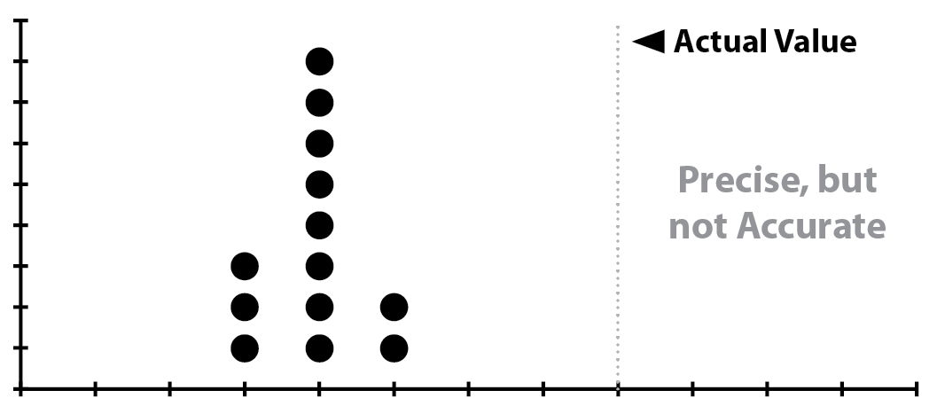
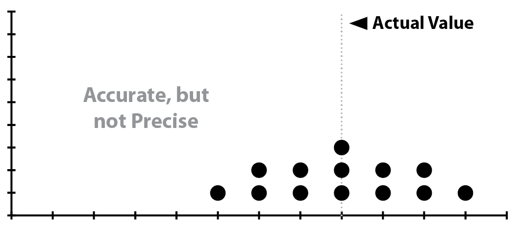
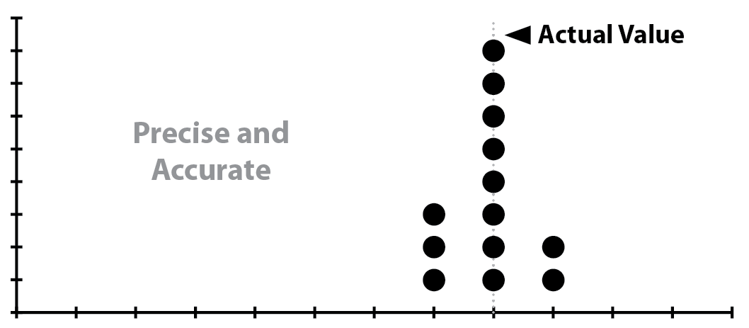
In histograms of measurements of the same value — such as measuring the length or weight of the same object multiple times — accuracy and precision manifest as the sort of plots seen below:
Mean, Median, and Mode
The mean is often called the average. Calculate the mean by adding up all the values in your data set, and divide by the number of values.
The median is the middle value in a data set. List the values in numerical order from smallest to largest. The number in the middle is the median.
The mode is the number that occurs most often. If no number in the data set is repeated, then there is no mode.
If your experiment involves finding a value, for example a time, rate, or density, a histogram will make it easy to illustrate these three to the children.
- Prepare a large piece of paper, the bigger the better, with a grid on it.
- Select one unknown, and plot its actual value mid-way along the x-axis.
- Mark the y axis from one to the number of teams.
- Assign a volunteer to supervise the chart when children have results to report. One member of each team reports the team’s result. The volunteer helps him plot the point on the chart.
- Display the histogram during the conclusion of your activity. Help the students find and mark the mean and mode (if there is one), and calculate the mean.
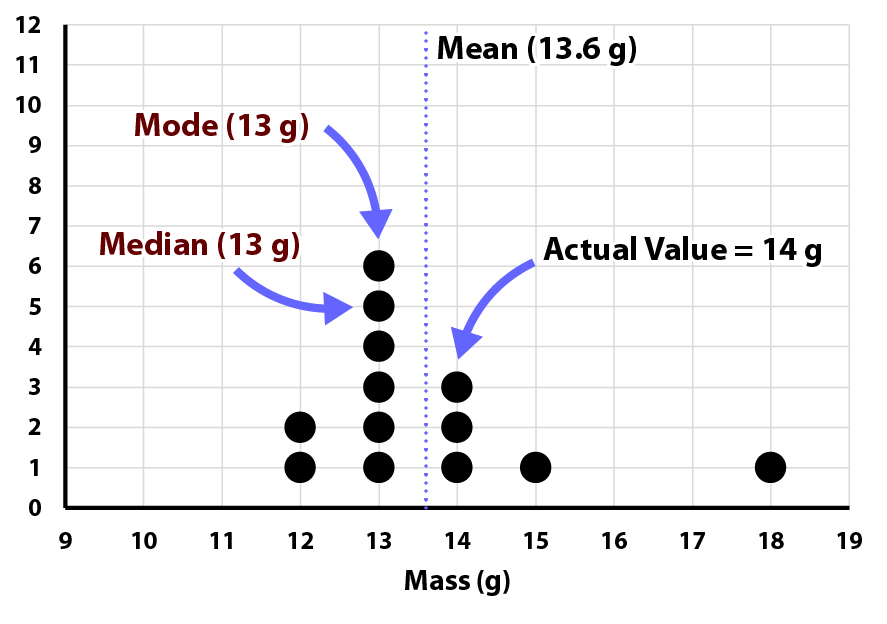
In the above example, students determined the weights of items using a homemade balance.
The students might consider the effect of any outlying values. What happens if you take away the 18 g data point? The median and the mode don’t change, but the mean is now 13.2 g, closer to the mode and median. Why is there a range of values? Ask the students what mistakes they might have made, or what things are hard to do exactly the same way very time.
Accuracy & Precision
If you have already introduced accuracy and precision the students can consider both from a histogram prepared from their results. Consider the previous example. What happened to the precision of the results when the 18 g data point is removed? (The precision improved.) What happened to the accuracy? (It decreased.)
If your experiment involves elapsed time, such as how long it takes for a ball to roll down a ramp at different angles, consider choosing two values to plot, the shortest time, and the longest. Be sure that your x-axis is marked to accommodate the expected range of values with room for an outlier. You may need two volunteers to manage the chart, one for each time, especially if the results come in all at once towards the end of the activity. The data from one such experiment is plotted below.
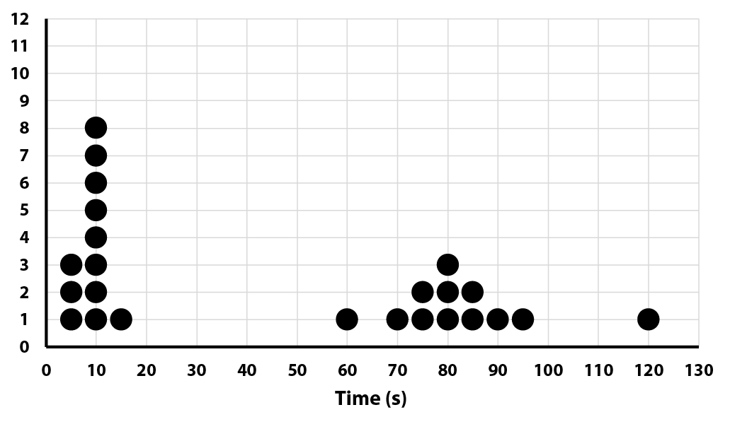
Ask the students to consider explanations if the precision differs between the short and long times. Consider instrumental (e.g., what are the smallest marks on the ruler?), human (e.g., how quickly can you see the ball cross the line and press the stopwatch?), or other factors (e.g., does the ball sometimes wobble back and forth on the track, losing energy?). You may need to seed a question or two to get the children thinking.
Outlying or Unexpected Values
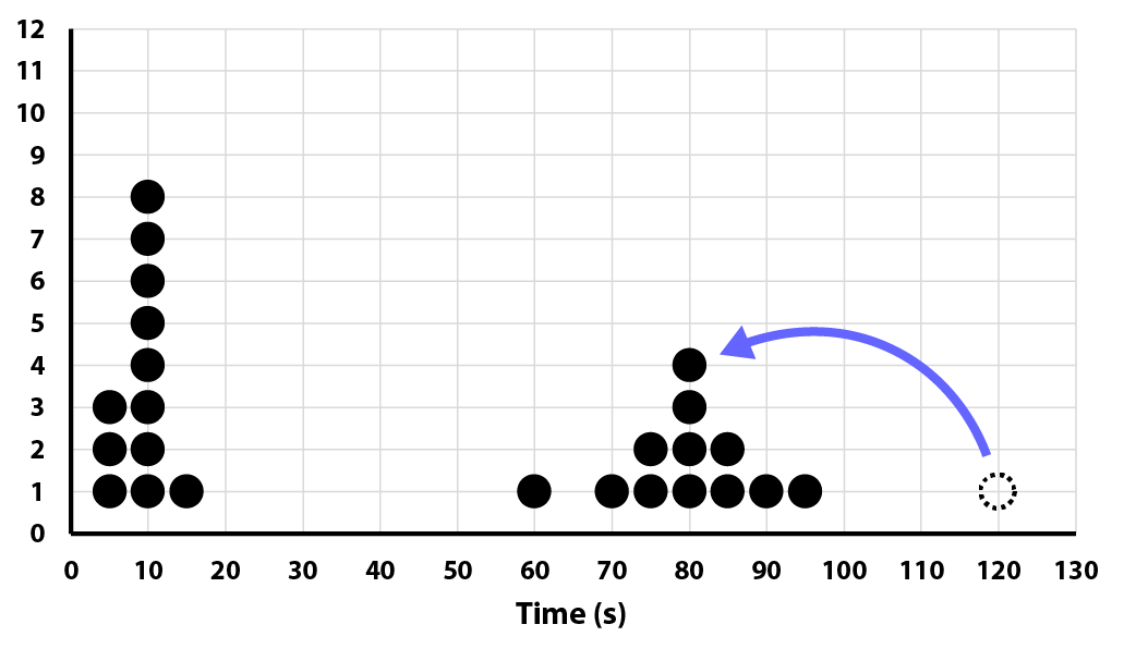
It is tempting to ignore data points that are unexpected, or don’t fit in nicely with the other values. That value could be a mistake, but it could also be the most accurate, or provide an important clue to the truth. Consider the first example. Keeping the 18 g value improved the accuracy of the results. Sometimes a mistake made is obvious. In the preceding example consider the value at 120 seconds. The students used a count up timer, recording time in minutes and seconds. Might a student have misread 1:20 as 120 seconds rather than 60 + 20 = 80 seconds? If so, that puts the data point in agreement with the others. (In this case, the students confirmed that was indeed what had happened.)
Why you need more than two data points
How many data points are needed to get accurate results from an experiment? Although you won’t be discussing correlation coefficients with your students you can use their results to show why you cannot simply take two data points, draw a line between them, and assume you can extrapolate valid data from that line. If your experiment involves plotting data that yields a curve rather than a straight line consider taking a few minutes to for this discussion in your conclusion.
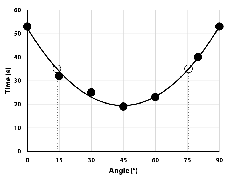
The following data was taken from an activity where students measured how quickly a bubble traversed a tube filled with oil, as a function of the angle the tube was tilted.
- On a white board or large piece of chart paper draw x and y axes, labeled appropriately for your data.
- Peruse your teams’ results, and choose one with the most complete, and accurate, data.
- Plot that data and draw a smooth curve through the points.
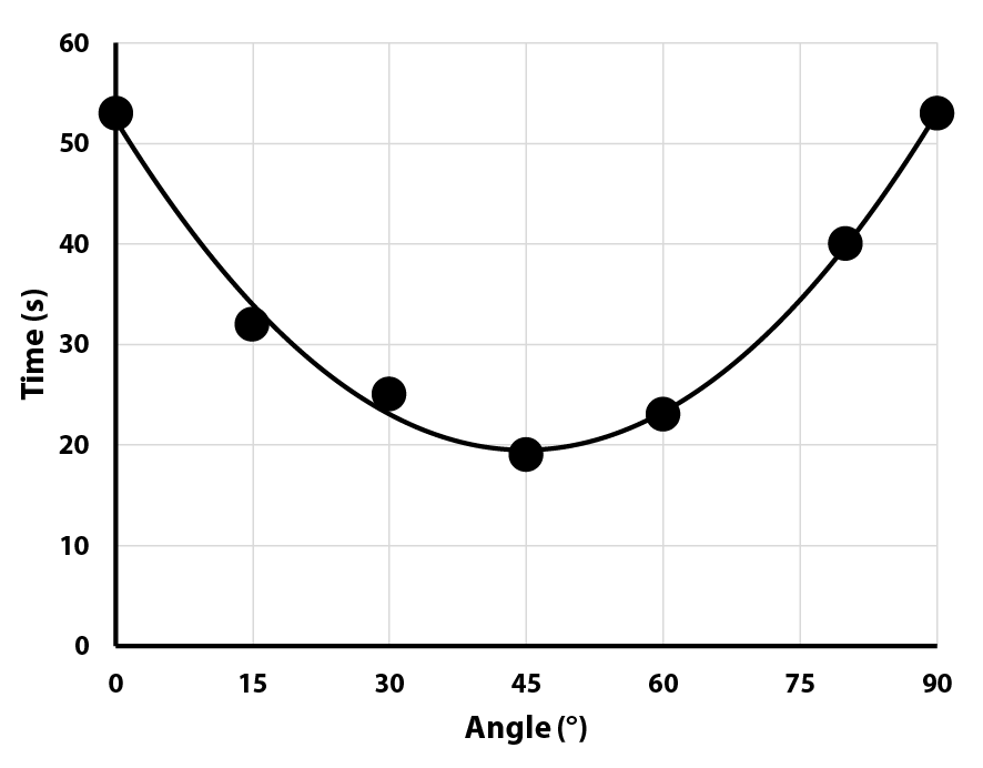
- Gather the children and with their help extrapolate a value on the x axis based on a value on the y axis. In this example the chosen time is 35 seconds.
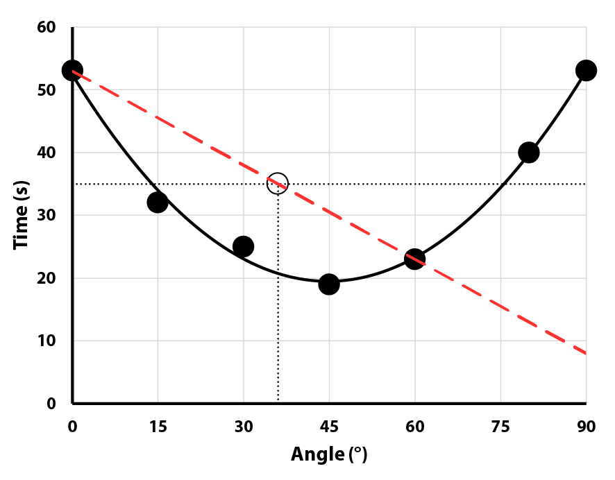
- Using a different color marker and a straight edge draw a line through two of the data points on the curve. (Here, 0° and 60°.) Extrapolate the x value from that line using the same y value as before.
- If possible, draw a second straight line, using a third color, through two other data points on the curve. (Here, 30° and 80°.) Extrapolate the x value from that line using the same y value as before.
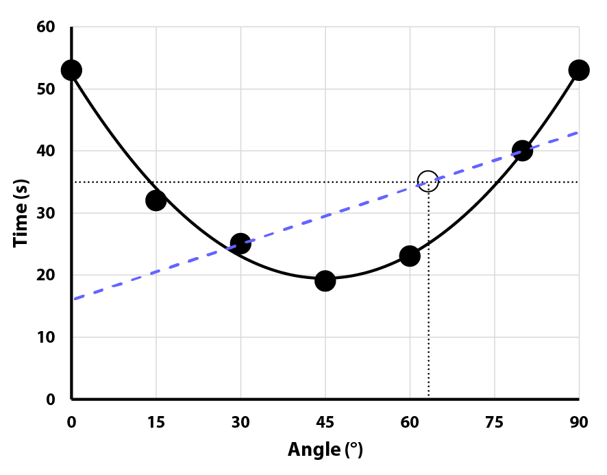
What angle will cause the bubble to reach the end in 35 seconds?
| Actual Curve | Line 1 | Line 2 |
|---|---|---|
| 14° or 76° | 36° | 63° |
What angle gives the fastest time?
| Actual Curve | Line 1 | Line 2 |
|---|---|---|
| 45° | 90° | 0° |
Quite a difference! The students will appreciate how important it is not to assume that all relationships are linear, and that you may need many data points to determine what the true shape of a curve is.
What interesting data analysis opportunities have cropped up in your activities? Have you developed an approach for conveying these or other concepts effectively that we don’t mention? We’ve love to hear your ideas and stories. Drop us a note or leave a comment!


0 Comments